
外掛說明
Blockshifter is a growing toolbox of display modes for native Gutenberg blocks — no new block types, no leaving the block editor, no learning curve.
Pick a block you already use — Gallery, Group — flip a toggle in its Inspector, and its front-end output transforms. The block itself stays 100% native and editable; nothing about how you write content changes.
Think of Blockshifter as a shape-shifter for your blocks: same content underneath, a different shape on the front end. Today it shifts into a Carousel or a Masonry grid; tomorrow more shapes join the same toolbox, each just as simple to switch on.
Carousel, live today
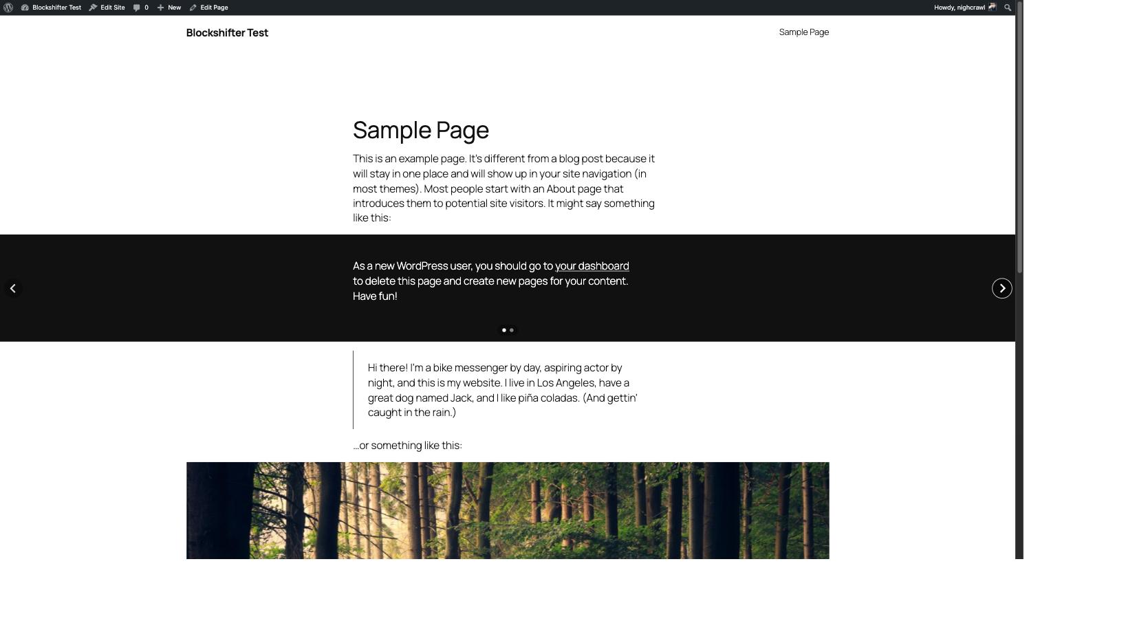
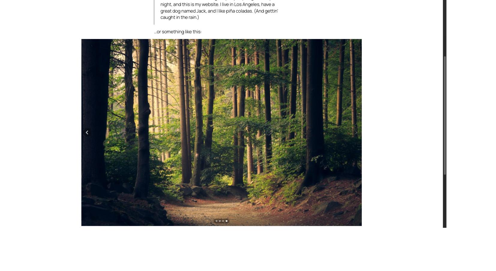
A clean, minimalist carousel for Gallery and Group blocks, powered by Splide.js — lightweight, accessible, dependency-free. Arrows and pagination are styled to sit quietly on top of your content, in any color, on any background.
- One toggle to turn a block into a carousel
- Slides per page
- Autoplay
- Infinite loop
- Fully responsive, keyboard and screen-reader friendly out of the box
Masonry, live today
A compact, variable-height masonry grid for Gallery and Group blocks, built with native CSS Grid — no third-party library. Every native Gutenberg setting stays in charge: Columns and Gap on Gallery, Gap on Group.
- One toggle to turn a block into a masonry grid
- Columns (Group only — Gallery keeps its own native Columns control)
- Respects each block’s native Gap and responsive behavior
- Degrades gracefully to a regular grid without JavaScript
More shapes are coming
Accordion and other display modes are on the roadmap. Every future module follows the exact same pattern you already know: pick a block, flip a toggle, done.
For developers
The list of blocks a module targets is filterable, so you can extend any module to other core blocks without forking the plugin — the filter name follows blockshifter/<module>/allowed_blocks:
add_filter( 'blockshifter/carousel/allowed_blocks', function( $blocks ) {
    $blocks[] = 'core/columns';
    return $blocks;
} );

add_filter( 'blockshifter/masonry/allowed_blocks', function( $blocks ) {
    $blocks[] = 'core/columns';
    return $blocks;
} );
Development
Source code, build tools and issue tracker: https://github.com/nighcrawl/Blockshifter
The src/ directory contains the human-readable, unminified source for everything shipped in build/. See the repository’s README for the build steps (composer install && npm install && npm run build).
螢幕擷圖
安裝方式
- Upload the plugin files to
/wp-content/plugins/blockshifter, or install the plugin through the WordPress plugins screen directly. - Activate the plugin through the ‘Plugins’ screen in WordPress.
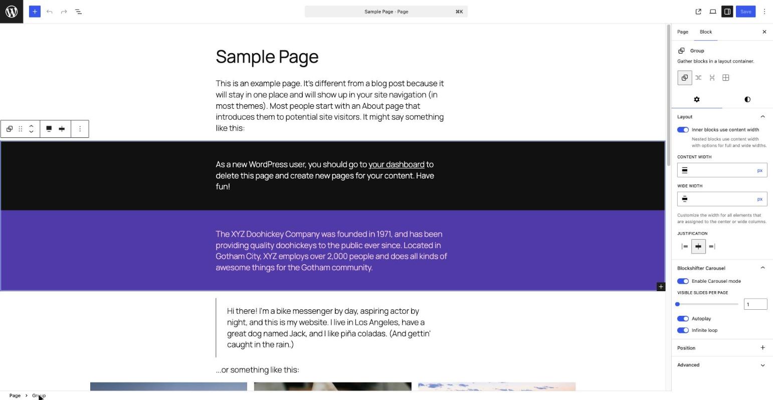
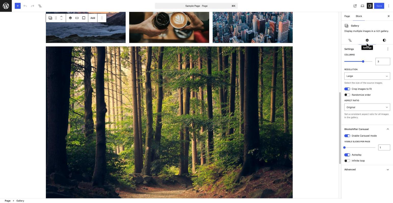
- Select a Gallery or Group block in the editor, open the Inspector, and enable the “Blockshifter Carousel” panel.
常見問題集
-
Can I use this on blocks other than Gallery and Group?
-
Not out of the box yet, but developers can extend any module’s target blocks via its
blockshifter/<module>/allowed_blocksfilter — see the Description above. -
Are other display modes (Accordion…) available?
-
Not yet — the current release ships with the Carousel and Masonry modules. More are planned.
-
Is this plugin free?
-
Yes, Blockshifter is completely free, with no premium tier at this time.
使用者評論
這個外掛目前沒有任何使用者評論。
參與者及開發者

變更記錄
0.2.0
- Adds Masonry, a second Blockshifter module: turns a Gallery or Group block into a compact, variable-height CSS Grid layout, with the same “pick a block, flip a toggle” pattern as Carousel.
- Gap and (on Gallery) Columns always come from the block’s own native Gutenberg settings — Masonry never duplicates them.
- Matches Gallery’s native responsive behavior (two columns on narrow screens, configured column count above) on both Gallery and Group.
- Degrades gracefully to a regular, non-overlapping grid without JavaScript.
0.1.0
- Initial release: Carousel, the first Blockshifter module, for the Gallery and Group blocks.