
外掛說明
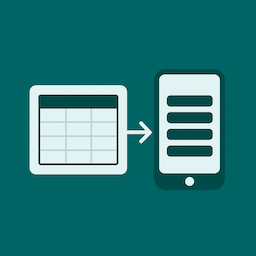
Responsive Table for Elementor is a lightweight, easy-to-use widget designed to make small tables look beautiful on any device. Unlike bulky table plugins, this widget focuses on simplicity and readability — perfect for tables with up to 5 columns that automatically transform into a clean card-style layout on mobile.
If you don’t need huge spreadsheets or endless columns, and just want a sleek, responsive table that works out of the box, this widget is for you.
Perfect for:
– Pricing tables
– Schedules and timetables
– Feature comparisons
– Any compact dataset that must look great on mobile
Features (Free Version):
* Fully responsive tables that stack into cards on mobile
* Customizable table header and body styles
* Toggle borders on/off
* Unlimited rows (up to 5 columns)
* Simple Elementor widget interface — no shortcodes needed
* Input HTML into cells
* Easily adjust row background colours for better readability
Pro version (coming soon!)
– Icons inside cells
– Add buttons to cells
– More than 5 columns
– Border styling
– Horizontal Scrolling for larger tables
– Priority support
If you want to be notified when the Pro version launches, click here.
Arbitrary section
If you have questions or feature requests, feel free to contact me at thewebdesigncoop@gmail.com.
螢幕擷圖

Desktop table view 
Mobile stacked card view 
Elementor widget settings panel
安裝方式
- Upload the plugin files to the
/wp-content/plugins/responsive-table-for-elementordirectory, or install via the WordPress Plugins screen. - Activate the plugin through the ‘Plugins’ screen in WordPress.
- Open Elementor, search for “Responsive Table”, and add it to your page.
常見問題集
-
Can I add unlimited columns?
-
The free version supports up to 5 columns. The Pro version (coming soon) will support more columns and more advanced features.
-
Is it compatible with all themes?
-
Yes. The widget works with any theme that supports Elementor.
-
Can I customize fonts and colours?
-
Yes. You can adjust typography, colours, and spacing directly in the Elementor panel.
使用者評論
參與者及開發者
變更記錄
1.1.1
- Tested with WordPress 6.9
1.1.0
- Major update with significant styling improvements and new responsive options
- Added mobile card styling options (card header background, text color, border radius)
- Added border toggle for mobile cards
- Added capability to input HTML in table cells for more flexible content
- Added row labels in the editor for better organization of table rows
- Fixed styling conflicts with Hello Elementor theme
- Removed first column background control for better UX
- Improved responsive table behavior on mobile devices
- Fixed title row text color behavior on stacked cards
Note: This is a major styling update that improves responsiveness and adds mobile card customization options. You may need to recheck your table colors and backgrounds after updating.
1.0.0
- Initial release with responsive stacking table widget for Elementor
- Basic styling controls for table, header, and body